
LinearGauge
LinearGauge (Linear Gauge)
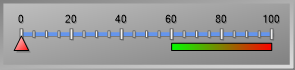
The LinearGauge is an indicator object used to visualize numeric data on a horizontal or vertical plane (similar to a thermometer or ruler).
It is generally preferred for displaying physical quantities that “fill up” or “rise,” such as Temperature (Thermometer), Level (Tank height), or Distance.
Info: This object shares the same technical infrastructure as the CircularGauge and NumericIndicator. Only the method of data presentation (Linear instead of Angular) is different.
Quick Design: Gauge Wizard
The most practical way to configure this object—determining whether it is “Linear” or “Circular” and setting its orientation—is to use the Wizard located in the Advanced panel.
- Open Wizard: Select the object and go to the Advanced panel. Click the button next to the Wizard row under the top Custom category.
- Gallery: In the window that opens, navigate to the Gallery tab from the menu on the left.
- Select Type: Open the “Gauge Type Groups” box and select Linear (for Thermometers, Rulers, etc.).
- Select Template: The templates in the gallery will transform into horizontal or vertical bars. Select a style you like from the menu on the right, pick the specific gauge, and click Finish.
- Result: Your gauge will transform into the selected professional design (colors, frame, needle type, etc.) within seconds.

Properties Panel – Key Properties
Once the appearance is set via the Wizard, you establish the tag connection here to make the gauge functional.
Value
- Default (Tag):
- Function: This is the main connection determining the position of the Pointer or the fill level of the bar.
- Usage: Bind an Int or Float type tag here (e.g., Tank_Level). As the tag’s value changes, the gauge updates with an animation.
Events
- Mouse Down / Mouse Up: Can be used to trigger an action (e.g., opening a detail page or resetting a counter) when the operator clicks on the gauge.
Advanced Panel – Key Properties
Beyond the Wizard, this panel is used to manually configure the gauge’s orientation (Horizontal/Vertical), limits, and colors. These settings are grouped under the Gauge Container.
1. Orientation
Determines whether the gauge lies horizontally or vertically.
- Path: Gauge Container -> LinearGauges (Collection) -> Orientation.
- Options:
- Horizontal: Horizontal placement (e.g., Ruler).
- Vertical: Vertical placement (e.g., Thermometer).
2. Scales (Min/Max)
Determines the operating range of the gauge.
- Path: Gauge Container -> LinearGauges -> Scales (Collection).
- Settings:
- Minimum: Start value (e.g., 0).
- Maximum: End value (e.g., 100).
3. Pointers
Changes the shape of the indicator that points to the value.
- Path: Gauge Container -> LinearGauges -> Pointers (Collection).
- Type:
- Marker: A sliding icon in the shape of a triangle, square, or diamond.
- Bar: A bar that fills up as the value increases, similar to mercury in a thermometer. (Ideal for tank level displays).
4. Colored Regions (Ranges)
Used to color specific intervals (e.g., Red for 80-100).
- Path: Gauge Container -> LinearGauges -> Scales -> Ranges.
- Settings: Identical to the CircularGauge. A region is created by defining StartValue, EndValue, and FillColor.
Common Usage Example
Example: Furnace Temperature Bar (Thermometer)
To display a furnace temperature between 0 and 250 °C as a vertical thermometer.
- Add a LinearGauge to the screen.
- Open the Advanced -> Wizard menu, select the “Linear” group, pick a vertical style (Thermometer look), and apply it.
- Go to the Advanced panel and follow the path: Gauge Container -> LinearGauges -> Scales.
- Set Minimum: 0
- Set Maximum: 250
- Select the object and return to the Properties panel.
- Bind the Furnace_Temp_Tag to the Value -> Default (Tag) property.
Result: In Runtime, as the temperature increases, the bar on the gauge will rise from 0 toward 250.