
Advanced Panel
Advanced Panel
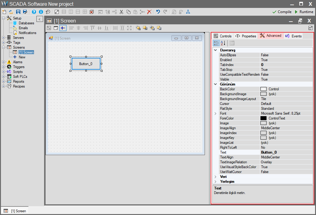
The Advanced panel contains the fundamental .NET properties of an object. The settings you configure here determine the object’s defaults, meaning its static (fixed) state.
The properties in this panel are common to all SCADA objects and are essentially identical to the standard properties of .NET objects.
Advanced Panel Common Properties
Below are the descriptions of the basic .NET properties found in this panel, categorized for clarity.
1. Appearance
This section statically controls how the object looks on the screen.
| Property | Description |
| BackColor | The default background color of the object. SCADA Relation: Acts as the “Default” value for the Back Color property in the “Properties” panel. |
| BackgroundImage | A static image to be placed in the background of the object. |
| BackgroundImageLayout | Determines how the background image fits into the object (e.g., Tile, Stretch, Center). |
| Cursor | The type of cursor to display when the mouse hovers over the object (e.g., Default, Hand, Cross). |
| FlatStyle | Determines the appearance style of controls like buttons (e.g., Standard, Flat, Popup). |
| Font | Determines the default font type, size, and style of the object (e.g., “Microsoft Sans Serif, 8.25pt”). SCADA Relation: Acts as the “Default” basis for the Font property in the “Properties” panel. |
| ForeColor | The default color of the text on the object (e.g., Black / ControlText). |
| Image | An image (icon) to be displayed on the object (independent of text). |
| ImageAlign | Determines where the image defined in the Image property aligns within the object (e.g., MiddleCenter, TopLeft). |
| ImageIndex / Key / List | If an ImageList component is used, determines which image from that list the object will display (by index or key). |
| RightToLeft | Sets whether the text direction is right-to-left (Yes). |
| Text | The static text appearing on the object. SCADA Relation: Determines the “Default” value for the Text property in the “Properties” panel. |
| TextAlign | Determines how the text in the Text property aligns within the object (e.g., MiddleCenter, TopLeft). |
| TextImageRelation | Sets the position of the Text and Image relative to each other within the object (e.g., Overlay, ImageBeforeText). |
| UseVisualStyleBackColor | Determines whether objects like buttons use background colors consistent with modern Windows operating system styles. |
| UseWaitCursor | Forces the “wait” (hourglass) cursor to be displayed when the mouse is over this object. |
2. Behavior
This section defines the object’s basic interaction and usage properties.
| Property | Description |
| AutoEllipsis | If True, the object’s text is shortened with an ellipsis (“…”) if it does not fit within the boundaries. |
| Enabled | Determines whether the object is “active” (clickable/usable) by default. SCADA Relation: If False, the object remains permanently passive. If True, the Enable property in the “Properties” panel can manage this dynamically (by toggling True/False). |
| TabIndex | A number (starting from 0) that determines the order of navigation between objects using the Tab key on the keyboard. |
| TabStop | If True, allows the user to focus on this object using the Tab key. |
| UseCompatibleTextRendering | Determines whether text is rendered using the old (GDI) or new (GDI+) rendering engine. Usually left as False (new engine). |
| Visible | Determines whether the object is “visible” on the screen by default. SCADA Relation: If False, the object is never visible. If True, the Visible property in the “Properties” panel can manage this dynamically. |
3. Layout
This section determines the object’s position, size, and resizing behaviors on the screen.
| Property | Description |
| Anchor | Determines which edges the object remains “anchored” to when the screen or window is resized (e.g., Top, Left). |
| AutoSize / Mode | If True, allows the object’s size (usually Height or Width) to automatically adjust based on its content (text or image). |
| Dock | Determines which edge of its container (panel or screen) the object will “cling” to completely (e.g., Top, Fill). |
| Location | The default X (horizontal) and Y (vertical) coordinates of the object’s top-left corner. |
| MaximumSize | Limits the maximum size the object can take during AutoSize or manual resizing. |
| MinimumSize | Limits the minimum size the object can take during AutoSize or manual resizing. |
| Size | The default Width and Height values of the object. |